Monday 22 April 2013

Week 12- Landscape Drawing- Hebden Bridge

This is the Landscape Drawing in Hebden Bridge drawn in oil pastels. The theory of landscape is that you need to find a good perspective and then chose a focal point with some good composition. This drawing's focal point is the boat and it is within the rule of thirds. This drawing is interesting because it uses a blend of oil pastels together to form new colors to make it look impressionistic and abstract which complements the drawing nicely. The artist had used this method on the bridge because there were two colors that he wanted to blend to make a nice texture which were black and and pale brown. There is some good composition in the drawing and there is a nice use of an implied line involved in the drawing as well. The implied line goes from the trees to the boat to the bridge and then to the foot path which is interesting because it redirects the eyes across the page. In addition, there are some blended colors to represent the reflection of the boat in the water which works really well together. Furthermore, it was raining on that day which helped the artist blend the colors really well with the rain.

In conclusion, this is a very successful drawing which has excellent composition, uses the rule of thirds, implied line and experiments and blends in other colors to create a successful drawing. Good Job.




Week 11- Landscape Drawing- Centenary Square


 This is a thumbnail drawing of the Centenary Square in Bradford. The theory of Landscape drawing is that you need to find a good perspective and an interesting focal point to keep the viewer interested. This is the thumbnail of the Centenary Square and the artist chose this because it has good composition and has an implied line that follows those three tower spikes. It does align with the rule of thirds as you have the top right of the drawing which is in the rule of thirds. The focal point is the fountain and the building behind.


These are the two thumbnails for the courthouse and the Town hall. The first one of the Town has some good composition and is within the rule of thirds. The Tower reaches the rule of thirds which is the main focal point and then goes in to an implied line from the Tower to the other buildings. If you look closely, you can see a strong curved arc of the implied line where the eye hits the tower and then follows down to the buildings beneath it. The second thumbnail doesn't clearly describe anything because it is unfinished. Landscape drawing is probably my weakest area in drawing and the artist needs to improve on this to increase the quality of his drawings, and will work harder to improve. In conclusion, these drawings are weak and unsuccessful, and unfinished because it is my weakest area. Overall, most of them demonstrate good composition and show good perspective along with some interesting focal points.


Week 10- Classical Interior Architecture


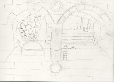
This is a 45 minute drawing of the Architecture opposite of the first floor stairs in the Leeds City Library. Classical Interior Architectures are the designs in places such as Libraries, Worship, Museums or Government Offices are associated designs to do with wealth, majesty, power, history, craftsmanship or Beauty. Classical Interiors occur in all forms in media and are recreated in designs of real places or influenced in design in games and animation. The artist chose this particular piece of architecture because there is a sense of balance and symmetry architecture of the pattern on the stairs on the left and the stairs on the right. It is balanced on either side of the drawing. What is inspiring about this piece of architecture is the way that these arcs are curved and formed, and gives the sense of geometry because its architecture. There is some shading involved which gives the feel of 3D through the use of light and shadow. This is a successful drawing and could use some extra detail to show the textures and surfaces of the drawing.


This is the second drawing which took 50 minutes. It demonstrates excellent composition and fits in to the rule of thirds. It is quite an inspiring piece of architecture. There is line present in this drawing from the direction of the dog to the pillar and then to the lion. It would have been nice to see some light and shadow to make the drawing feel 3D. Overall, the drawing has some very strong composition along with a good perspective which creates interest to the viewer.


Week 9- Non-Human Anatomy


 This is a 8 minute drawing of an anatomy of a bird at the Leeds City Museum. The same basic principles of anatomy still apply such as the muscular and bone structure in this bird. The sense of weight, balance, gesture, and poses still apply to human anatomy. This is the bird that the artist had to drawn and captured which represents excellent gesture. It implies that the bird is looking behind him which draws the viewers attention to the direction he is looking towards. This is a static pose in which the bird is standing and has balance.


This is 20 minute drawing of an Ape/Gorilla. You can see that there is a strong sense of pose and gesture as the Gorilla/Ape is hanging on to a tree branch (even though it isn't their on the paper) which becomes unbalanced and is supported by the muscles and his skeleton in his right arm.This is a Dynamic pose where you can see the tension form in his right arm holding on to the branch. This is  an open form. There isn't much accuracy in proportion and has sausage like limbs present. In conclusion, it demonstrates the non-human anatomy of the ape and bird and indicates good areas of balance and weight, and has strong gestures present.


Week 7- Figure Drawing- Posture, Weight, Balance and Dynamism

 These are some quick sketches of a figure demonstrating balance, weight, pose, and dynamism. Drawing movement and action in drawing needs these key skills because it absolutely crucial for animators when they are animating. To draw movement you need to show and now what dynamism is. There are two types of dynamism, which is static and dynamic. Static poses are when a character is still and balanced while dynamic poses are when the character is moving and often show tension in the forms and axis. There are also forms where the figures have open and closed forms. Open forms consist of expansion such as spreading their limbs. Closed forms are where the figure is concentrating, shrinking and pulling inward. Here are some examples of quick sketches of the figure representing dynamism, poses and open and closed form that the figure is making.


This is a drawing of Steve in an Open form as he is moving with the sphere. There is a sense of the figure being unbalanced as his right leg of his muscles and skeleton is supporting the weight. The drawing has captured a great sense of dynamism. Overall, the drawing is almost equally in proportion and some good use of muscle definition present in the figure and shows good anatomy.


 This is a dynamic pose of Steve as he is moving. The drawing captures the dynamism well as his hips, arms and head move while the feet almost stay the same. These are all open forms and have good indication of gesture in all of them and you can follow what the figure is doing like in a frame by frame sequence of an Animation. The size, volume and proportion of figure changes throughout the key poses. In conclusion, the drawings it self are successful as they capture the essence of dynamism.


Week 6- Figure Drawing


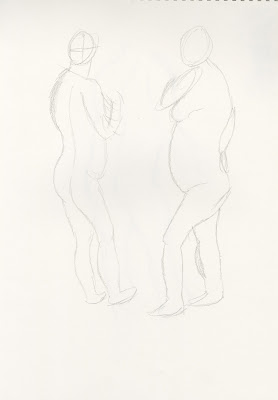
 This is a quick sketch of the human figure. Figure drawing or life drawing is the study of the human body so that we can learn and understand how the muscular and bone structure of the human body work, and is crucial form animators as it studies how humans move. These quick sketches show some great poses of the figure.


Here are some more poses of the figure. There is more muscle and skeleton definition present here such as the legs, arms, spine and the feet. There is lack of proportion.


In this drawing, you can see a very strong gesture present of Leslie sitting down and looking up. Gesture defines the character's mood and expression, and conveys life in to drawing.There are some definition in the curves of Leslie which gives a sense of shape of the spine and the thighs. There is a good sense of balance and weight in the posture as she is sitting down, apart from that it looks like she is sitting down on an invisible chair and haven't been able to draw it in. The proportions are inaccurate especially in the arms and legs. However, there is some really great shape definition on the head which looks good. Furthermore, there is no muscle definition in the arms and legs, and lacks in detail to make it feel 3D. In conclusion, this has been an unsuccessful drawing, but did demonstrate some good poses along with balance and weight.


Sunday 7 April 2013

Week 5- Foreshortening

This is a cross over of still life and figure drawing : The Human Skeleton as it shows foreshortening and extreme perspectives. Anatomy is the study of the architecture of the human form. It is important to know how the muscle and bone structure of the body work. Angles and foreshortening are vital in a drawing which shows the main lines in the body and help to ensure an accurate drawing. Pose is a term which helps to define everything to do with the positioning of the body and limbs. It helps us build a character and tell a story and its a vital knowledge for animators. Proportion is the key of having anatomy and anatomy is the key of having proportion and without it wouldn't be anatomy and would just look unbalanced an inaccurate. 

This is drawing of a skeleton which displays strong foreshortening along with oblique angles such as the leg. The Leg was facing the artist and effected the artist's perspective and caused some distortion of the angle of the leg and was proven difficult to draw. The Leg should have been more higher and the angle should have been more acute. The good thing about this drawing is that it has some strong foreshortening and has some good angles of the skeleton such as the arm and leg. The image isn't that clear as the right arm seems to be missing, but it is still there and just sketched in lightly. The drawing seems to have two right arms, but the other one is wrong because it is at a different angle than it should have been.

In conclusion, this has been an unsuccessful drawing because there are a lot of mistakes and has incorrect proportions along being unfinished. Overall, it does display some strong angles and foreshortening.